Description of weekly feedback

In a real insurance market, when you win some policies, you get some feedback.

From tonight onward you will be receiving this market-level feedback in your weekly email! :minidisc:

Note: remember that your model plays in thousands of markets each week (see evaluation metric).

1 Plots and KPIs :bar_chart:

1.1 Profit Vs Market share plot


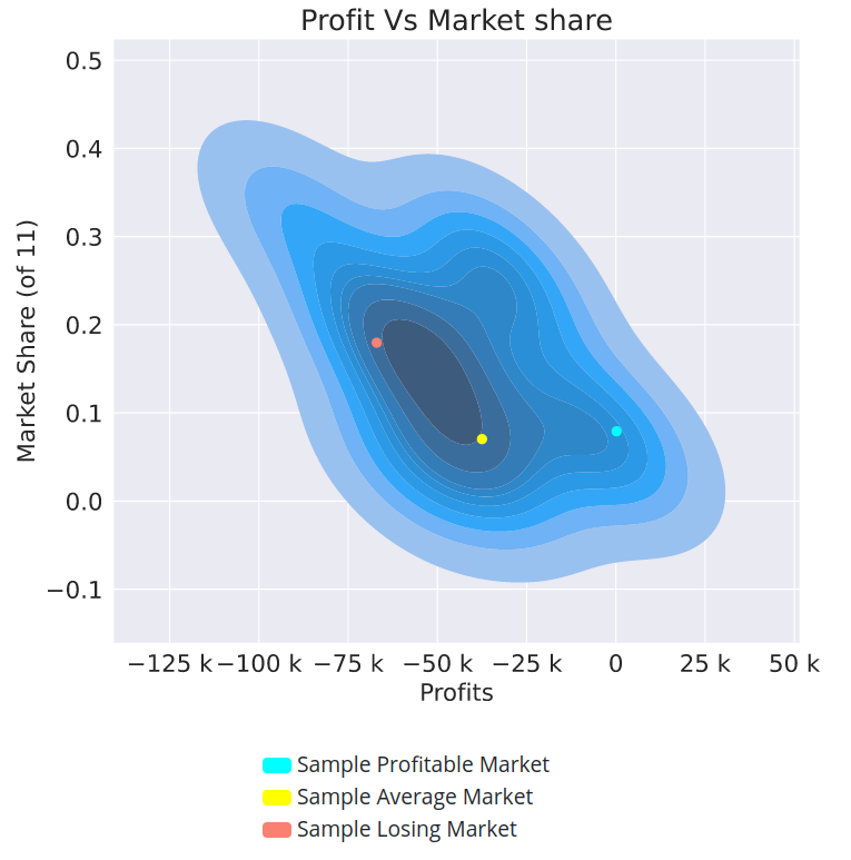
In this plot you see your profits and market shares plotted against each other for each market you participated in.

So what are the blue, yellow, and red dots?

We put all of your markets into 20 groups, from your most profitable (group 1) to your least profitable (group 5). The blue, yellow, and red dots represent sample markets from groups 1, 10 and, 20. In other words:

Blue dot. Randomly selected market from your 5% most profitable markets.

Red dot. Randomly selected market from your 5% least profitable markets.

Yellow dot. Randomly selected market from the middle 5% of your markets.

Note that these 3 groupings are quantiles and so each contains the same number of markets.

1.2 The KPIs below to the plot :balance_scale:

For a description of how the KPI are computed please see this post.

1.3 Claim heatmap plot :fire:

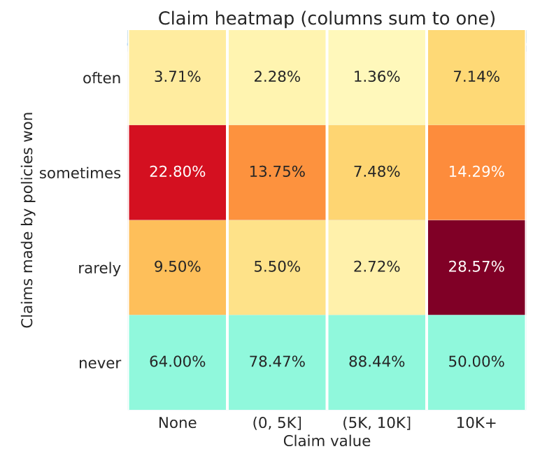
This is a column normalised heatmap. Each column sums to one. That means each column represents the total claims made in the whole market (not just won by you) in a particular band.

  • X-axis. Groupings of policy claim values as they appeared in the entire market.
  • Y-axis. Your policies won often, sometimes, rarely, or never.

In this plot you want the top three rows to go from hot red (on the left) to cold white on the right, with the bottom row % values increasing from left to right. That is unless you have a great strategy for those policies that do make a claim :slight_smile:

Let’s take a two columns as examples:

  • Left column. Here you can see among the policies that never make a claim (first column), this model only often wins 3.71% of them (not great). While you can see it wins 22.80% of these policies, sometimes. Not bad.
  • Right column. Here you can see a healthy pattern with the numbers increasing vertically. But ideally you would have 100% in the bottom cell indicating you never win policies with claims of more than €10K.

Note: The bottom row of this heatmap is always colored in blue to let you focus on policies that you do win.

2 The first 6 tables :floppy_disk:

You will see 6 tables below the plots that look like:
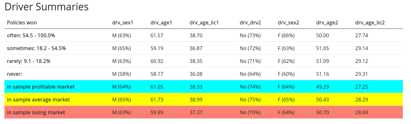
2.1 Table rows :rowing_woman:

First let’s understand what the rows mean:

  1. Policies won most often/sometimes/rarely/never: xx - yy%. Since your model plays in many of markets for the same set of policies, we can compute how frequently you win a specific policy. In other words, if you win the policy PLXXXXX in 20 out of 100 markets, then we can say you win this policy 20% of the time. We call this the conversion rate. We then split your policies based on their conversion rate into up to 3 groups of equal size from most often won to rarely won. The conversion rate range is represented by xx - yy. We also include a row with information about policies you never win.
  2. Policies won in sample profitable/average/losing market. These represent contracts won in one of the three sample markets represented by dots on your plot (see the section on plots).

2.2 Table columns :classical_building:

These represent summary statistics about the policies that you have won.

  • For continuous columns: the mean value is displayed.
  • For categorical columns: the most common category is displayed. In parenthesis we also show the proportion of that label within the contracts represented by that row. So for example, if you see M (55%) for the gender column on the Policies won in sample profitable market row. That means that of the policies you won in your sample profitable market, the most common label was male, making up 55% of the contracts that you won.

2.3 Data within the tables :writing_hand:

Dataset summary tables

The first 4 tables are related to the dataset features:

  1. Policy summaries
  2. Driver summaries
  3. Vehicle summaries
  4. Location summaries

Financial summary tables

The final two tables are related to the financial performance of your model.

  1. Financials by conversion rate summaries. This table has 5 columns:
    1. Claim frequency. Fraction of contracts that made a claim
    2. Premiums. Mean value of premiums you have won.
    3. Conversion rate. The mean value of the conversion rate.
    4. Profit per policy. This is the mean value of profit per policy weighted by the conversion rate. To give you an idea of how profitable each segment is.
    5. Profit margin. This is the mean value of your profit margin calculated as ( predicted premium - predicted expected claim ) / predicted premium
  2. Financials in sample markets summaries. This table includes detailed information about the 3 sample markets and should be relatively self-explanatory.

3 Table about policies lost :chart_with_downwards_trend: (week 8 on wards)

Finally you will see one last table that shows you how your competitors performed in those three sample markets.

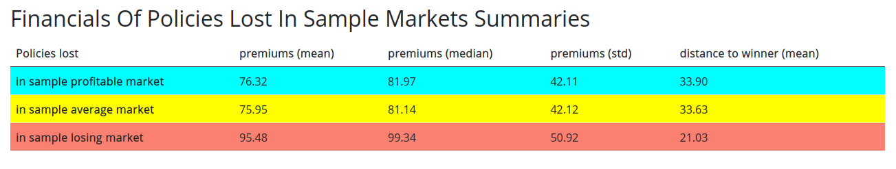
The main difference here from the other tables is that:

  • The first three columns indicate the mean, median and standard deviation of prices won by other models within those markets, for the contracts that you did not win.
  • The last column is the mean value of the difference between the price you offered and the price that was won, in those markets.

If you have any questions or comments please mention them here.

Good luck in the markets!
Ali

Note: this post was edited on Sun Feb 14 2021 to include the description of new feedback.

10 Likes

Hi, this will be valuable feedback i think! However I have a couple of questions:

  1. Am I understanding correctly that this model only wins policies for which there is a driver 2?

  2. In the point 2 often and sometimes have the same interval. Is this an error?

  3. Also am I understanding correctly that in this model case, every policy was at least won in 1.1% of the markets?

  4. Finally, is this based on the second pas which the model is only compared against the 10% best competitors?

2 Likes

Hi @joycelc

Glad to hear :slight_smile: To answer your questions:

  1. Yes it seem so as indicated by the (100%). But that could be distributional feature as well, that the vast majority of the data might have a second driver registered.
  2. It is not an error. We provide up to three groups. Sometimes there are not enough distinct conversion rates to create 3 groupings with equal size, in these cases we default to giving you 2 groups or even 1 group but with useful data. Otherwise it would just be very small and unrepresentative of your performance.
  3. Not every policy. It means that for policies that they did win, they won them in at least 1.1% of the markets. We don’t include information about policies that were never won.
  4. Yes! All data that we provide to you is always based on the second pass.
3 Likes

Hi alfarzan, it’s great you are providing more details each week but have you already sent the feedback for week 3? I haven’t got the email (I’ve verified all folders in my mail box).

Nope! not yet.

Since this is the first week we are sending it out we are sense-checking the values a bit more rigerously.
They should be rolling out from tonight :incoming_envelope:

Hi @alfarzan
Could you explain me how market share and coversion rate differ?

From the information I found:

MARKET SHARE:This is the mean value of the market-share in terms of the number of policies you have won

CONVERSION RATE:how frequently you win a specific policy

Shouldn’t be similar in the “Financials In Sample Markets Summaries”?
I have totally different number in week4.
For example if I have a conversion rate of 100% then should I also have a market share of 100%?

I have also a second question, I have feedback from week2 by email and feedback of week4 in the leaderboard…but what about week3?

Hi @pejo92

Yes they are different.

Let’s take the “Financials in Sample Markets Summaries” example and let’s look at one row in that table. Say the “sample profitable market”.

  1. Market share. This is the number of policies that you won in that sample profitable market, divided by the total number of policies up for grabs.
  2. Conversion rate. This is how often you normally win the policies that you ended up winning in the sample profitable market. So if you have a conversion rate of 100% here, that means that you always win the policies that you have won in this market. But that says nothing about your market share. You could only win one policy and still have a 100% conversion rate for that one policy.

The market share in one sample market and the over all conversion rate of a set of policies are not interchangeable. Is that a little clearer?

About your second question on the week 3 feedback: that was sent out last week in your emails. Have you not received it?

And if not, can you give me your submission ID from that week’s leaderboard so I can check?

Thank you for the quick answer.

For question number 1 about market share vs conversion now is super clear yes.

For question number 2 the submission ID is 113844. I’ve checked again and I have no email for it.

1 Like

That’s quite strange, can you also check with your teammate if they have received the email? I am checking with our team as well.

In the meantime I have sent you a private message with the feedback so you can conduct your analysis :rocket:

Hi @alfarzan,

my team (NoSePol) and I haven’t received the week 3 feedback in our emails too. We can only see the last week feedback directly on the leaderboard clicking on “view”.

Could you please upload or send to us also the week 3 feedback? N. Submission: 113779.

Thank you!

Cheers!
Jorgen

Hi @jorgen_ferluga

I have sent this to you privately as well, we seem to have had an issue with feedback being sent to some teams.

Please let me know if you have received it. :slight_smile:

Yes, I received it!

Thank you

1 Like

Is this interpretation correct for the plot?

  • A “market” is a 10-model auction for N policies
  • The dot density represents number of markets
  • The x-axis is the total profit achieved in 1 market
  • The y-axis is the count of policies won divided by N in 1 market (what is “of 186”, the number of markets?)

If this interpretation is correct, the plot is interesting, but I am struggling with what to do with this information. My plots are all going from the bottom left to the upper right, telling me that higher market share is correlated with higher profits, which seems to me to be saying more about the model sampling process for the auction than my model.

The feedback provided in this competition is quite different from what insurers would look at in practice. It seems more likely that insurers would look at financial metrics by the predictors in their model and wouldn’t really have access to the type of information given to us in the detailed feedback.

Hi @lolatu2

Yes! that’s correct.

Just to make sure we’re on the same page, the y-axis is what fraction of N policies in that 10-model auction went to your model.

“Of 186 markets” is a description of how many total dots exist in the plot.

Regarding model sampling and plot interpretation :thinking:

The model sampling process in each of these markets is based on the evaluation metric. In short, it’s uniformly random in round 1 of the metric and then the top 10% of the leaderboard will be in 90% of markets. However, to mitigate your worries about statistical representativeness, just know that the metric is actually computed analytically.

So how do you interpret this? That is up to you of course, but generally speaking, to me, the plots represent a sign about how much room you may have in increasing or decreasing your prices. If you have a positive profit to market share relationship, that tells me that your margins may be quite generous so that you can still win policies and increase market share with them.

The tables are more representative of what you might get in an insurance company at the end of the year, but with a lot less detail.

Regarding realism :oncoming_automobile:

You’re right that this is not entirely realistic, however, one of the key tasks in establishing market dynamics is to have the market “agree” on a reasonable price and a reasonable margin. These plots are aimed to give you that in-depth market level insights.

Having said that, we are cooking up some more realistic feedback for you very soon :man_cook:

Hope this clarifies things a bit more :slight_smile: