In a real insurance market, when you win some policies, you get some feedback.
From tonight onward you will be receiving this market-level feedback in your weekly email! 
Note: remember that your model plays in thousands of markets each week (see evaluation metric).
1 Plots and KPIs 
1.1 Profit Vs Market share plot
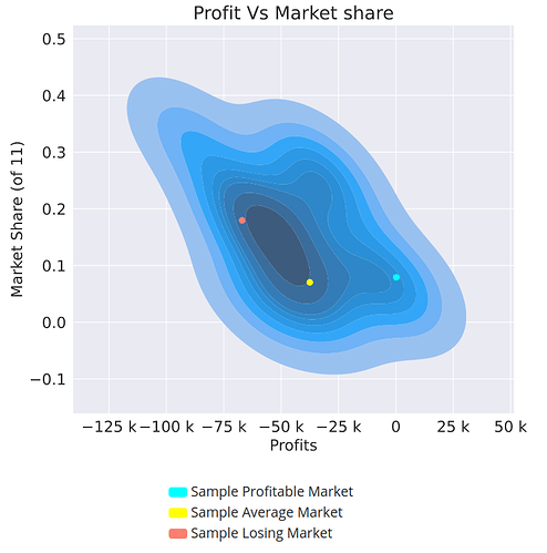
In this plot you see your profits and market shares plotted against each other for each market you participated in.
So what are the blue, yellow, and red dots?
We put all of your markets into 20 groups, from your most profitable (group 1) to your least profitable (group 5). The blue, yellow, and red dots represent sample markets from groups 1, 10 and, 20. In other words:
Blue dot. Randomly selected market from your 5% most profitable markets.
Red dot. Randomly selected market from your 5% least profitable markets.
Yellow dot. Randomly selected market from the middle 5% of your markets.
Note that these 3 groupings are quantiles and so each contains the same number of markets.
1.2 The KPIs below to the plot 
For a description of how the KPI are computed please see this post.
1.3 Claim heatmap plot 
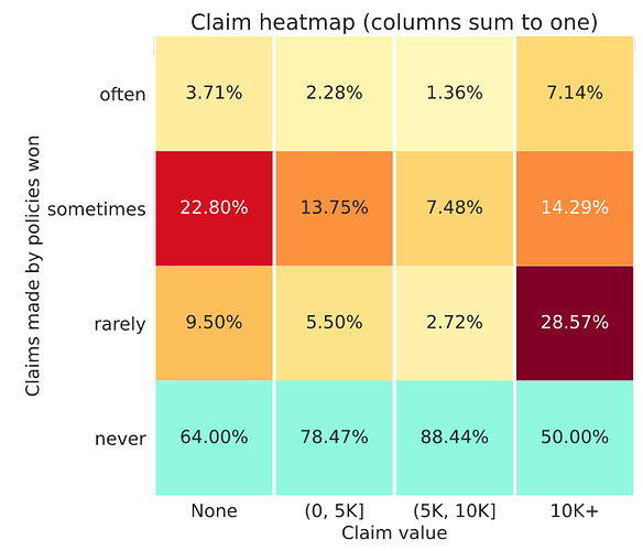
This is a column normalised heatmap. Each column sums to one. That means each column represents the total claims made in the whole market (not just won by you) in a particular band.
- X-axis. Groupings of policy claim values as they appeared in the entire market.
- Y-axis. Your policies won often, sometimes, rarely, or never.
In this plot you want the top three rows to go from hot red (on the left) to cold white on the right, with the bottom row % values increasing from left to right. That is unless you have a great strategy for those policies that do make a claim 
Let’s take a two columns as examples:
- Left column. Here you can see among the policies that never make a claim (first column), this model only often wins 3.71% of them (not great). While you can see it wins 22.80% of these policies, sometimes. Not bad.
- Right column. Here you can see a healthy pattern with the numbers increasing vertically. But ideally you would have 100% in the bottom cell indicating you never win policies with claims of more than €10K.
Note: The bottom row of this heatmap is always colored in blue to let you focus on policies that you do win.
2 The first 6 tables 
You will see 6 tables below the plots that look like:
2.1 Table rows 
First let’s understand what the rows mean:
- Policies won most often/sometimes/rarely/never: xx - yy%. Since your model plays in many of markets for the same set of policies, we can compute how frequently you win a specific policy. In other words, if you win the policy PLXXXXX in 20 out of 100 markets, then we can say you win this policy 20% of the time. We call this the conversion rate. We then split your policies based on their conversion rate into up to 3 groups of equal size from most often won to rarely won. The conversion rate range is represented by xx - yy. We also include a row with information about policies you never win.
- Policies won in sample profitable/average/losing market. These represent contracts won in one of the three sample markets represented by dots on your plot (see the section on plots).
2.2 Table columns 
These represent summary statistics about the policies that you have won.
- For continuous columns: the mean value is displayed.
-
For categorical columns: the most common category is displayed. In parenthesis we also show the proportion of that label within the contracts represented by that row. So for example, if you see
M (55%)for the gender column on thePolicies won in sample profitable marketrow. That means that of the policies you won in your sample profitable market, the most common label was male, making up 55% of the contracts that you won.
2.3 Data within the tables 
Dataset summary tables
The first 4 tables are related to the dataset features:
- Policy summaries
- Driver summaries
- Vehicle summaries
- Location summaries
Financial summary tables
The final two tables are related to the financial performance of your model.
-
Financials by conversion rate summaries. This table has 5 columns:
- Claim frequency. Fraction of contracts that made a claim
- Premiums. Mean value of premiums you have won.
- Conversion rate. The mean value of the conversion rate.
- Profit per policy. This is the mean value of profit per policy weighted by the conversion rate. To give you an idea of how profitable each segment is.
-
Profit margin. This is the mean value of your profit margin calculated as (
predicted premium-predicted expected claim) /predicted premium
- Financials in sample markets summaries. This table includes detailed information about the 3 sample markets and should be relatively self-explanatory.
3 Table about policies lost  (week 8 on wards)
Finally you will see one last table that shows you how your competitors performed in those three sample markets.
The main difference here from the other tables is that:
- The first three columns indicate the mean, median and standard deviation of prices won by other models within those markets, for the contracts that you did not win.
- The last column is the mean value of the difference between the price you offered and the price that was won, in those markets.
If you have any questions or comments please mention them here.
Good luck in the markets!
Ali
Note: this post was edited on Sun Feb 14 2021 to include the description of new feedback.


