Indeed it looks like the this week we have avoided larger claims. The two competitors at the very bottom of the leaderboard are giving us the weekly summary statistics.
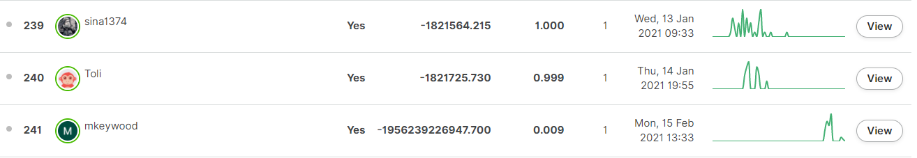
Special prize for an explanation of mkeywood’s “profit” at 0.9% market share!
Indeed it looks like the this week we have avoided larger claims. The two competitors at the very bottom of the leaderboard are giving us the weekly summary statistics.
Special prize for an explanation of mkeywood’s “profit” at 0.9% market share!
Haha 
I would feel it is not my place to reveal the strategy of @mkeywood on this one, but I did look into it to see what is going on.
Genuinely I have no idea what happened there. I was 4th last week, and then this abominable result this week, BUT I have not seen any leaderboard feedback for week 8 or 9 (ie, at all) so I have been fishing in the dark  )
)
Anyone who can help explain it to me, i’d be happy 
Ah your feedback is actually on the submission itself.
If you go to the leaderboard, click on “view” next to your leaderboard submission and then navigate to the “evaluation status” tab you will see the feedback
I think I may have joined this challenge a little late (week 8) to really get a handle on it, but I hope they do more like this. Adding this pricing aspect is way way more interesting than just claim model prediction
Thanks @alfarzan for your explanation, but I must say I am still a bit lost.
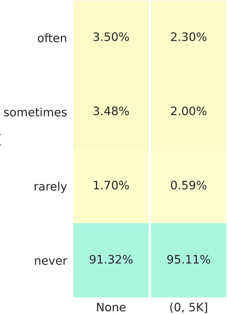
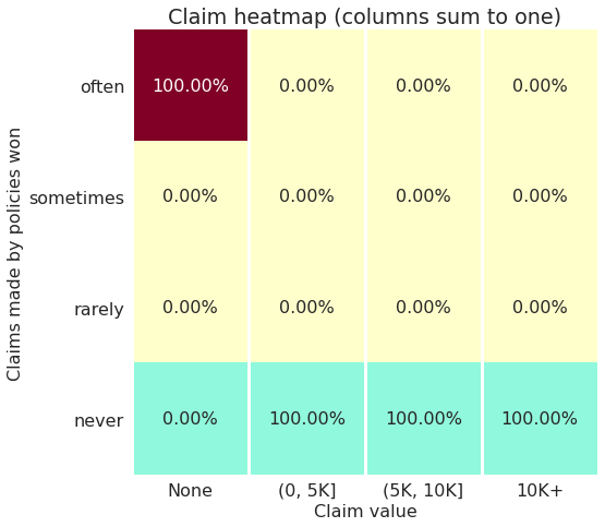
Taking your toy example with 10K claims, with a 10% frequency, and ignoring the last 2 columns which are very rare.
There are some approximations here, but overall, as the two values for “often” are larger than both values for “rarely” I don’t see any solution where the number of policies are equal… so I might be misinterpreting the heatmap somehow 
I have the same confusion as yours too.
If the number of policies is equally split among [often, sometimes and rarely] (the nominator), and the fractions are different, the denominator must be different.
My guess on why high profit loads are required:
As the (top 10) competitors are becoming niche and better, it is more likely for us to pick up underpriced policies, therefore apply a higher profit load protect us against it. All in all, if we have a super high profit load and not winning many policies, our profits will be close to 0 and enough to beat many other competitors. In other words, to beat the top and niche player, we need to be niche as well!
Ahh ok I see what you (and @davidlkl) originally meant now.
The answer is not going to be very satisfying I’m afraid: these are small measurement errors.
In reality when we have to construct the quantiles, it’s not always exactly equal and we have to allow the algorithm some leeway to make things approximately equal. When the market share is very low, when we are contructing these buckets, that error becomes relatively large. Hence the issue you observe.
I’m attaching another feedback with a average marketshare of ~0.05 so you can see that the numbers become closer when the buckets are constructed using more inputs.
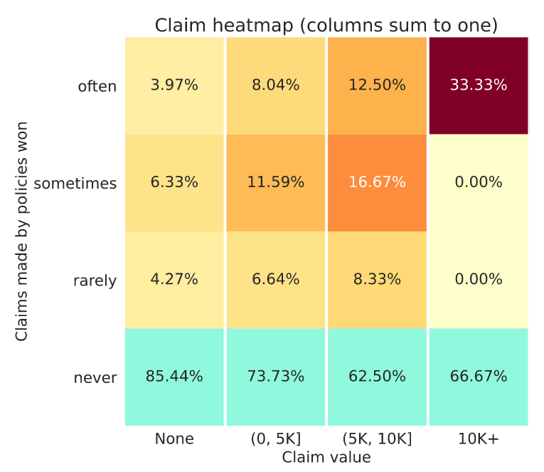
Here assuming claim frequency of each category being 10% of the last.
In this case we have:
Again not exactly equal but approximately similar
I’m not sure what others think but I’d say that the ideal plot* could look something like this:
Of course you could say that if you price things properly you want to get some of the claims and still make money, but this is just one version of what a good plot could look like.
(* Obviously based on fake data)
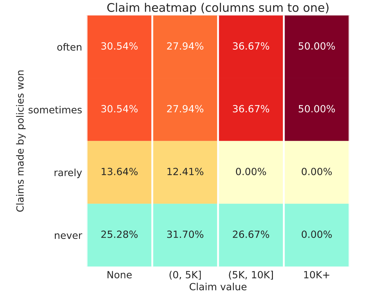
okay. so half of the policies that I win often and sometimes have a claim over 10k? am I reading that properly?
No actually, you win half the policies that make more than 10K in the entire dataset often + sometimes.
oh I see, thanks for the interpretation.
If I assume that’s your feedback from week 9 submission then I’d conclude that it’s not ideal.
In many ways it’s similar to my week 8 submission when I had a similar looking chart, a similar high market share and a low leaderboard position. The difference is my week 8 RMSE model was 500.1 ish and your week 9 is 499.46 ish.
Now you’d hope that a model with a much lower RMSE should be better at differentiating risk. If that was the case though you’d expect to write a smaller market share of the the policies with higher actual claims. Your chart though doesn’t show such behaviour. That may be because your good performance on the public RMSE leaderboard is not generalising to the unseen policies in the profit leaderboard. This could be a result of placing too much emphasis on RMSE leaderboard feedback and not enough on good local cross validation results. It can lead to unwittingly overfitting to the RMSE leaderboard at the expense of a good fit to unseen data.
Now I think I have a similar issue, ie a poor fitting model as my week 8 and week 9 charts are less that ideal… (I’d rather have a chart like @davidlkl but with greater market share). But the cause of my issue is that in seeking not to overfit too much I haven’t fit well enough relative to others.
Another point to investigate is your market share. A 30% market share, suggests your profit margin is set lower than competitors. In a pool of 10 people a 10% market share would be a a reasonable target to go for.
The only difference between my week 8 and week 9 submission was that I increased my rates by a fixed single digit percentage. I’ve learnt that I perhaps increased rates too much as my market share has fallen further than I’d like.
So for my final submission I’ll be refining my model and making a minor tweak to my profit margin. (And no doubt subsequently regretting doing so as I see my profit leaderboard position plummet!)
I’ve been giving this a lot of thought… that it’s now given me a headache. So, I’ve been hung up on how there isn’t a strong correlation between RMSE and profit in the leaderboards (thanks @michael_bordeleau for simulating the profit correlations with other metrics) . Not that I expected a perfect correlation, but I did initially expect that there would be a much stronger correlation than what we’re seeing. Thinking about this more, I think what this line of thinking is missing is that in a sample against 9 other models, you just need one better model in the 9 competitors to get adversely selected against.
There are around 20 models in the top 10 percentile deemed “competitive” that all models are competing against. Let’s say there’s 1 super good model and the rest are all baseline models. The chances of your model being put up against the super good model is (19 choose 8) / (20 choose 9) = 45%.
So even if there’s just 1 model that’s better than yours in the top 10 percentile, you’re going to be against it almost half the time. In those situations, your model’s profit is going to be if there are pockets of profitable business that the really good model is not capturing and yours is. Since in this hypothetical situation, the super good model is better than yours, you wouldn’t be able to tell where those pockets are.
If this thinking is correct, maybe RMSE isn’t the best metric to use, but having a really good model still matters quite a bit.
The other variable in the profit leaderboard is how much profit load competitors are tacking onto their pricing strategy. Based on the discussions, it seems that many people are increasing their profit loads (we also see more participants with profit in the more recent weeks). So there’s also a guessing component of what others are doing because if everyone else increases their loads, then you probably need to too. But are they? And if so, by how much? I wish we could get “industry feedback” every week. That would be interesting to see on average how much loads competitors are charging. I wouldn’t add this feature this late into the competition, but maybe for the second round .
Not knowing how your price compares to the market definitely makes this challenge more difficult than real life insurance, where you can just ring your competitor, or visit their website to get a quote.
The problem is that the industry load (which is essentially an average) will not help. At least for me, I do different load for different segment. You can’t tell which segment I am going after even if I tell you my portfolio average.