Hello everyone,
I am presenting an approach that visualizes the recorded episodes of the Flatland environment.
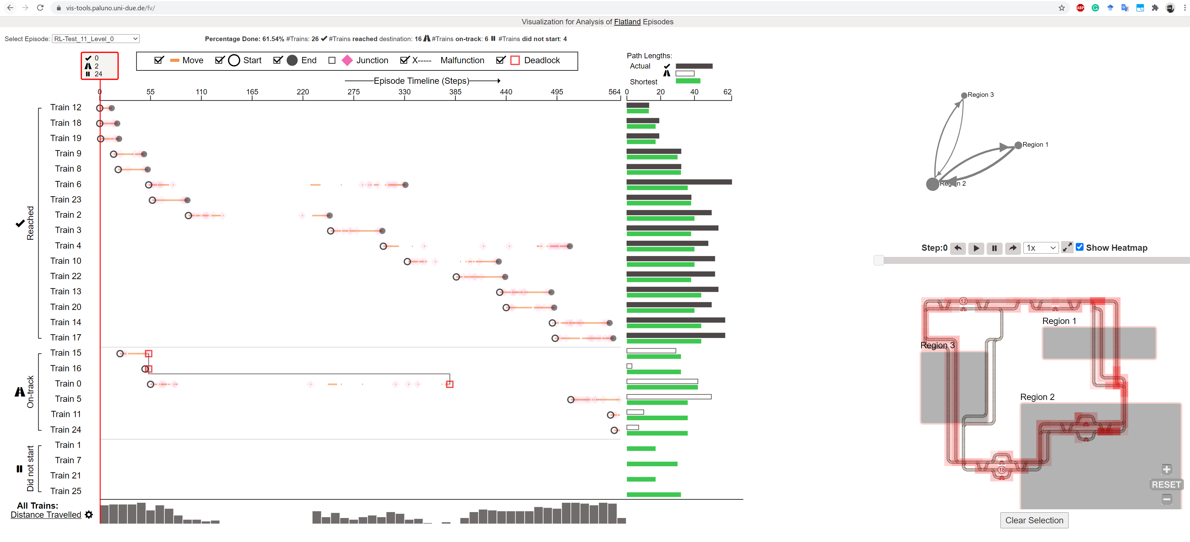
The interface is mainly divided into three following linked components:
- Timeline Visualization (Left):
It provides a temporal overview of all the trains in the episode. Time is represented on the horizontal axis, while each train is represented in a row. The timeline shows the train movement, start/end times, junctions, malfunctions, and deadlocks. At the end of each row, black and green bars show actual path length and shortest path lengths respectively.
- Map View (Bottom right):
The map view shows the environment of the recorded episode and also serves as a playback component. The step by step animation can be enabled by clicking on the play button. The component also contains a heatmap visualization showing the occupancy (in the number of timesteps) of each cell. Zooming and panning are enabled on the map view. Specific regions can be selected via rectangular shape enabled by clicking and dragging.
- Graph View (Top right):
The graph view shows an abstraction of movement between selected regions. As soon as a region is selected from the map view, it is abstracted and represented as a node in the graph view. With two or more regions selected, the movement of trains between the regions is shown as directed edges between the respective nodes.
A version of the project is hosted on the web and can be accessed here: https://vis-tools.paluno.uni-due.de/fv/. Soon it will have a functionality that enables the users to upload their log files and generate the visualization.
The project code can also be found on GitHub: https://github.com/shivamworking/flatland-visualization. It contains a python backend with preprocessing scripts that enables users to upload .pkl files and generate a visualization.
The project is under active development and has some bugs (e.g., full-screen of map view). I am working on them. Please feel free to document the bugs in the repository. The visualizations developed were based on the requirements gathered through interviews of flatland community members (many thanks  ). I come from a background in visualization research and want to build useful solutions for the flatland community. In order to do so, please feel free to share the necessary features in the visualizations that you wish to see in the future. I plan to include this work in my Ph.D. dissertation. Hence, for research and to improve the visualizations, I will soon come back with a request to share your feedback via a short online survey.
Feel free to contact me to get in touch. My email: shivam.agarwal@paluno.uni-due.de
You can also find me on Flatland’s Discord server.

